Making Backseat Screen Navigation Work

A simple scheme for locating stuff on the screen for another user.

We’ve all had it happen, someone else is driving the mouse and you’re trying sitting next to them trying to tell them what to click.

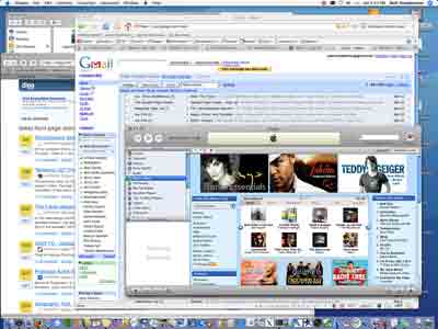
Confusing Screen

“Click Movie Trailers.”

“Where?”

“Right by your mous…you moved it.  Go down.  No dow…too much, go back up…stop, no up an inch.”

“I don’t see it, where?”

“In the blue box.”

“What are you talking about?  The whole screen is blue.”

“Stop wiggling the mouse! You’re almost on i…no, stop, you’ve missed it again. :sigh:
Can I drive for a second?”

“Fine!!!”

Sound familiar?

This all too common conversation is the source of much frustration.  I’ve had it with my wife, my parents, and even with coworkers… people who use computers every day.  So what’s wrong — why isn’t the obvious… well… obvious?

The problem is that the way we use mice is like the way we drive a car.  We don’t think about using it, instead it magically seems to follow where our focus of attention is on the screen.  So, when something isn’t apparent on the screen, we go searching for it and our attention wanders, and the mouse follows it — much to the annoyance of the person feeding instructions by relative offsets of where our attention was, not is.

What we need to solve this problem is a simple way of getting both parties focused on the same area using absolute terms. When the resolution of attention is focused tight enough, the desired object will easily leap off the page.

Here’s a technique I came up with while backseat driving my wife through a software application.  I’ve successfully used it at work in complex development enviroments.  I’ve even guided someone through an OS install and update from 10 feet away using it.  You’d be surprised at how simple the technique is.

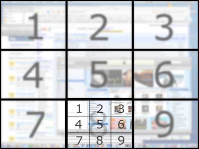
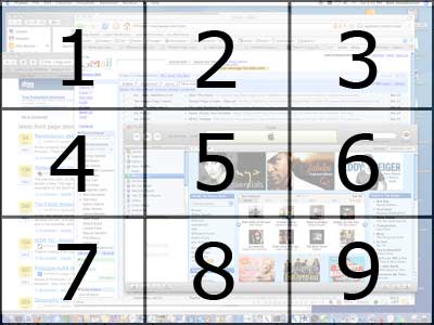
Simply agree to divide the screen into a 3×3 grid, assigning each cell a number 1-9, using the same scheme as a touch tone phone.

Dividing Up a Screen

Just call out the cell number.  e.g., “8”

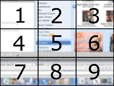
If the person doesn’t click on the thing you told them to, then divide up that grid, mentally, the same way.

Grid in Grid

To which you call out a sub-cell.  e.g., “2”  (Thus, this is cell 8-2.)

Grid, two deep

I’ve never had to go deeper, as the originally sought item becomes apparent to the user.

So, back seat driving would sound like this “Click ‘Movie Trailers’, eight, two.”  And in moments, the user has it.

Movie Review: V For Vendetta

V For Vendetta — go see it, it’s more entertaining than it is political.

Before going to see V For Vendetta, I heard two things:  1) “This movie really bashed on the conservative party, portraying them as evil, and the liberals as good.”  2) “This movie condones, if not encourages, violence.”

Having seen it, I walked away with neither of these two impressions, nor did I feel there was any strong political message.  The movie portrays a more modern version of Orwell’s 1984 using a just slightly futuristic Britain in a fictional, sensationalized comic-book style.

In a nutshell, society gave up too many freedoms, turned the other way once too often, and in doing so allowed a dictator to rise to power.  ‘V’ uses “constructive” violence — targeting those personally responsible with justice, resistance where he knows someone’s doing mortal harm, and warned destruction to wake society up to the corruption around them in order to remind them they aren’t indeed powerless. His motives are well intentioned for the betterment of society, although his technique of the ends justifying the means smacks more of a Batman philosophy than a Superman one.
The story was engaging, the acting was well done, and the visuals were on target — only two buildings blew up, and it was in the style and quality you’ve already seen in Independence Day.  And, for what it’s worth, the building were unoccupied — he was destroying a symbol, not trying to take lives by this action.

If I had to find a beef about the flick, there’s a few minutes where they show victimization of homosexual lifestyles, and the problem there is that it didn’t add anything to the movie.  This set of scenes could have just as easily been cut and the movie would have been just as strong; all citizens were suffering under the oppressive rule, not just one group.

Naturally, one can read more into a story than is there.  The message I got was the slippery slope argument about what happens if things go unchecked.  A country’s citizens have civic responsibilities that must be exercised or be lost; these include educating themselves, doing what’s right for the common good (even if it isn’t in your own personal best interests), and taking a positive active role in governing society in order to stave off corruption.  Random acts of violence, or even violence as an outleashed emotional expression were not endorsed, perhaps because they are so ineffective.

Interally, I would recoil if the liberal side actually views the conservative side in this manner (and also if the reverse is true) — for that would mean we don’t look at what is, but simply project our fears blindy onto another group; this is the exact tactic the movie’s dictator used to spawn division in order to get a strong hold in the first place.

I suspect the more accurate statement is that the extremists have taken over the popular political labels of our times, and that the majority of the population actually shares the same goals, but simply differs on how to accomplish them effectively. If anything, ‘V’ calls for a unification of the citizens to work together, to be something better; meanwhile the dictatorship uses the 1984 technique of redefining ‘unification’ to take on new meaning.

Will this movie inspire citizens to become terrorists?  I seriously doubt it.

So, go see the movie, get a big box of popcorn, and have a very entertaining 2hrs and 12min with the opportunity for delightful discussion over dinner afterward.

Jumping Optical Mouse: This Is Gross

How to fix the most common problem with optical mice — warning: it’s gross.

It seems that there are a large number of people experiencing problems with optical mice erratically jumping to a new position on the screen.

In the most common case, this is simply a matter of the table surface being oddly patterned or textured.  You know this is the problem when the mouse just goes in the wrong direction for no good reason.

In the least common case, there’s actually a hardware problem, and you can often get the vendor to replace it.  This exhibits itself as the slightest touches sending the mouse pointer rocketing to one of the screen corners.

But there’s a fairly common problem that most people have over looked, and it’s friggin’ gross, but knowing about it fixes the problem in most cases.  I put this tech solution in the “Everybody Poops” bin. You know you have it when your optical mouse works fine most of the time, and for no apparent reason will make a short hop to a new location near by the old mouse cursor position.
Perhaps you’ve heard of keyboard plaque, that nasty cruft that collects on keyboards?  Well, part of the reason we’re all using optical mice is because a wheel mouse picks up dirt and dust off the table and it eventually gets wrapped around the internal rollers, meaning you have to take the wheel out and pick the crud off.  But with optical mice, that shouldn’t be a problem… right?

Problem is our hands sweat as we use a mouse.  Natural oils and preperation rub off on the table.  This can make small sticky areas for dirt and dust.  Dead skin comes off too, which some estimates say is what 90% of indoor dust really is.   This builds up as an area of concentrated table plaque.

If you look real carefully and up close at the area where your mouse sits on the table, you’ll see it is covered with little dark grey specs.  And long before you notice these, your optical mouse has to dance over them.  Unchecked, they’ll get quite visible and even flake off.
Who knows what the mouse optics see, but the texture and reflectivity radically change for an instant, and your optical mouse will jump on the screen trying to compensate for the motion it incorrectly perceived.

The solution is simple, borrow a credit card, cause you most likely won’t want to use your own, and scrap the table surface with its edge.  You’ll notice stuff coming up easily, and a hint here: it’s not the finish.  In moment’s you’ll have a clean surface, and surprisingly your mouse will start working again.

Google Pages

Moments ago I tried Google Pages. Conclusion: I like it.

After reading a Digg story about Google Pages coming back online, I went to sign up, but got a kind letter that they were swamped and not taking additional users at the time.

But this morning I got a nice letter from Google stating they’d finally activated my account and to give it a try.  So, I put together a simple web page.  http://walt.stoneburner.googlepages.com/

The interface provides a simple what-you-see-is-what-you-get editor in a web environment, which is pretty impressive when you think about it. It’s the kind of be-prepared-to-be-blown-away thing you’ve come to expect from Google.  In fact, Google’s recent blast of web innovations may have made you so desensitized that you look at this one and go “so?”

You get the standard stuff you might expect that you’d see from Google Mail: images, links, bold, italic, bulleted lists, colors, fonts, sizes, justification, with the addition of headings, subheadings, minor heading, and the ability to edit the page’s HTML (nice).

What impresses me is that Google seems to have done all this site design by using Cascading Style Sheets in a very clever and clean way.  You provide the content, and Google provides the presentation.  They’ve got a number of themes and layouts, all independent of your page’s content.

At the moment, doing a view source on a Google generated page reveals a very clean looking, and nicely indented, piece of crisp HTML.  The CSS is readable, and the content is well marked up with DIV tags.

Anyone who’s looked at Google’s other pages knows they compact and often obfuscate their web code.   Consequently the first thing I did with a basic page was save the source for later study.  If anyone can teach us about the web, it’s Google.

Creating new pages is almost like making a Wiki, you give a page title and it figures out where to store the page internally.  It’s also got a nice page management system, where you can edit changes to pages and then publish them.  This way no one catches your site in mid-progress.

In the looking-a-gift-horse-in-the-mouth category, there are two potential concerns for Google Page users.

One, because Google Pages is releated to your GMail account, there’s a lot of buzz in the tech news about GMail addresses being easy to harvest.  Take my page, for instance, and it’s easy to figure out my GMail address is [email protected].  This actually doesn’t bother me, because Google does an amazing job at filtering spam.  Plus, I’ve grown to learn that you can’t hide your email address, because anytime you send an email, or your friends mail you a evil survey, they’ve just published your address all over creation and who knows how many times it will get forwarded because people are too lazy to strip off message headers.  (Please people, stop hitting Reply-All and start trimming out stuff that isn’t content; and while you’re at it, stop including large images in emails – it isn’t necessary.)

Two, this begs for the potential of external advertising to be added to your pages.  So far, that doesn’t seem to be happening.  I’m a big believer that any page I write should have only the content I put there.  Further more, if I happen to participate in Google’s AdSense, then I want my advertisements generating revenue for me.  Now, given that Google knows who I am and what my AdSense account is, there’s no technical reason they couldn’t do this already, assuming I wanted to do that.  But as it stands right now, the point seems entirely moot, given that I haven’t seen a lick of advertising appear in content I’ve made.  I classify this decision as supportive of Google’s “Do No Evil” stance.  Thank you, Google, for making this a non-issue.

I see Google Pages as a means that people can quickly set up simple web pages and get quick results.  It’s not a be-all end-all solution, nor was it intended to be from the looks of it.

For more serious depth, without the hassles of learning HTML, one should delve into Nvu, or, if you got the money for it, invest in DreamWeaver.

So, while I don’t know if I’ll use Google Pages myself for any serious work, it certainly is a good place to send people who just want to slap-dash a a few pages together.

The Brevity of Technology

Brief Tech.

Chris Fischer writes in his LiveJournal that he received an email where his boss, an educated man, sent him a terse four word email that looked like it had been composed on a cell phone.  Chris, a master at human observation, expounds on five thoughts relating to brevity.

Here I add my own observations, noting the technology has a greater influce over our habits than perhaps we first give it credit for.

In the latest book by O’Reilly press, Mind Performance Hacks, chapter 2 provides three tables in which, if you memorize and use, result in your ability to physically write, or type, faster.  The trick?  Use ‘c’ for “see”, ‘u’ for “you”, ‘t’ for “the”, and so forth.  This macro-based compression little language exists so that one doesn’t have to type out the full words while note taking.  But, let’s emphasize that last part: while note taking.  It isn’t intended for generic human consumption, just as shorthand is better transcribed back to English.

What I suspect we’re seeing is actually the bleeding of thought across media.  When I compose an email or a text message, I don’t think any differently.  However, I will alter my behavior patterns to address short comings of a device.

A cell phone represents a very clunky interface that is difficult to type on.  Additionally, the phone company seems to want to charge per character (keep messages short) or per message (maximize as much content into a small envelope = abbreviate).  Either way, the device conditions us to chuck vowels, trim letters, make clever substitutions, or toss words.

Another problem exists, and that’s at the opposite end of the scale.  A device can be too efficient.  Take a Palm Pilot for instance.  A capital ‘E’ turns from four discrete strokes into a single gesture that resembles a backwards three.  The problem is we spend so much time using the device that it usurps the correct behavior, conditioning us to do it in a manner more efficient for the device to process, and we’re rewarded by speed improvements and higher reliability of letter detection.
As such, watch an engineer write on a whiteboard, and almost always you can tell which ones own and heavily use PDAs.  The tool alters the way we work, and eventually our automatic behavior of what an ‘E’ should look like.

One might be able to argue that, just as a PDA alters our habitual representative alphabet, a cell phone alters our habitual semantical notations.  Because what we see corresponds to what we’re thinking, we don’t notice that the syntax might not be necessary, or even appropriate, for the medium being used.  In fact, medium has become so transparent to the end user, it wasn’t until just now that I realized I wasn’t writing with a feathered quill and India ink.

States of Matter

I was talking with my wife when she suddenly went silent deep in thought, got a strange look on her face like an epiphany struck, and bursted out laughing to the point of tears.

Upon composing herself, she shared the moment: “I just realized that one orifice has the natural capacity to expel three of the four states of matter!”  And then she busted out laughing again.

Hmm.  True.  I never heard it expressed quite like that before.

Cartooning: The Search for Step 3 1/2

I’ve been frustrated for quite some time at drawing books that go from scribbles to masterpiece in four steps. Here I talk about the ellusive step 3 1/2.

I’ve seen it, and you have too… the How to Draw books that teach illustration in four simple steps. It always starts off like this:

  1. Draw an oval.
  2. Fill in the body’s structure.
  3. Lightly sketch a little detail.
    >POOF!<
  4. A final crisp masterpiece glowing in perfection.

It’s like the cartoon of a huge scientific proof, with the most important step left out, labeled “Magic Happens Here.”

What’s problematic is that this step three-and-a-half is real, and I discovered it watching Dan Fahs try to show me how he drew his cartoon women. Since attending Art Klub, I see the magic happen when Jerry Carr and Kahlid Iszard draw their stuff. And no matter how slowly they go, it always happens.

The concept of step three and a half is based on an observation of perception that I stumbled upon years ago. As you’re going for a walk outside, pick an object in the distance that you’re eventually going to pass, say a tree or a telephone pole. Note to yourself that it is “far” away. Now approach it, and when it’s “near” come to a stop. Then back up just until it’s far. Then go forward until it’s near again. What you want to do is a kind of binary search, zeroing in on the exact point where your perception changes. On one side of the line, it’s far – on the other, it’s near. Surprisingly, there is a point and you can find it, and even stranger, a tag along observer will concur.

I suspect that the reason has something to do with the field of view, where said object hits some magical ration “filling the frame” or something.

But this effect can also be found in time when someone is drawing.

An experiment I’d like to formally conduct is to place an overhead video camera over an artist starting with a blank piece of paper and observe them going through a final illustration. Then using a computer, narrow in on the point where the picture goes from rough shapes anyone could crank out to the transformation of a wonderful illustration. It should be possible to identify the specific frame where this happens and then study the differences between the before and after set of frames. But even going this elaborate isn’t necessary.

From an observation standpoint, it seems that point where just enough detail exists to tip the scales so that the mind’s eye stops treating the basic shapes as basic shapes, but rather as a rough approximation of the actual subject. Further steps are simply a refinement.

And that’s my problem. Steps one and two of most how-to-draw books are too simple: place shapes down, then connect them. Step three gives a rough picture a child can do. And step four shows a completed picture with all refinements applied. The information that’s useful doesn’t seem to be written down, but resides smack between steps three and four.

Unfortunately, the artist may be the wrong person to ask. I don’t think they see it. Their perception is clouded by what’s in their head, not what’s actually on paper.

An experienced artist can conduct steps one and two in his head, and a really good artist is capable of doing step 3 in his head. All do the steps, but the masters have codified their illustratings to the point of complete internalization.

For instance, in my series of Napkin Comics, I don’t draw under pictures and skeltal structures. Rather, I fall back on little cheats I’ve invented for myself. The nose is the letter ‘C’, the face is a parenthesis ‘(‘, the wave of a girl’s hair might be a hidden square root symbol. Eventually these all become second nature, and I no longer think in terms of these artifical pen strokes. Obviously, I’m not going after realism, but even a simple cartoonist uses the same mechanisms.

My quest for the ellusive step 3.5 has taken me to examine sketch books of artists. I prefer pictures that aren’t complete and those that are paritally inked. Bud Plant has a wealth of sketch books where artists show unfinished sketches, doodles, and illustrations, many without the pencils or bluelines removed. Frank Cho has a brilliant set of sketchbooks, many featuring Brandy. Dean Yeagle has a fantastic set primarily featuring Mandy.

A good artists sketch book is far more valuable than a completed picture for the growing artist. First of all, by seeing all the “mistakes” and “discarded lines” it becomes clear that the talented artist build a scaffolding for their image and then later remove it; this is a wonderful confidence builder. Second, one sees that in initial cuts they’re not perfect, their circles and squiggles contain as many problems as the rest of ours; practice and determination do pay off. Finally, when the happy line finally happens, even if by accident, it visually stands out; the good artist finds it and draws (not traces) over it. Experienced artists that open their sketchbooks help us learn to see the world better and differentiate intermingled complexities.

Incomplete illustrations are like having access to the source code. With it, we get a greater sense of appreciation for the work, and those that want to learn to draw for themselves get to see the practical application — where theory and the real world part ways.

Often it’s not enough to know how an artist did something, but the why. And, I’m not talking about the symbolic meaning, I’m talking about seeing and undering what’s right, or wrong, about a particular pencil stroke, and more importantly, how to make it better.

At some point, it may come down to conducting an external analysis of various artist’s works — because if there’s a book out there on step 3 1/2, I haven’t seen it. Perhaps the only way to nail down the missing step, capturing it from the view of an outsider, is to actually write the book myself.
OpenOffice and .WBA Files

While trying to import a .WBA file into Thunderbird’s address book, I learned a bit about .WBAs, mailing lists, and how far Open Source applications have come.

My wife, Tamara, was president of the Washington Calligrapher’s Guild, for quite a while.  Among her many tasks was sending email notification to hundreds of members.  Although she’s stepped down to take on some larger commissions and projects, she still handles the group notifications on occasion for important announcements.  Many of the members use web based accounts either through their ISP or Hotmail, and most anti-spam packages recognize a bulk message from Hotmail as being a bad thing — as such, important notifications never make it to their destinations.

A guild member who manages the current list of email addresses sent an updated list, and my wife who’s technically savvy in such matters bumped into a problem, so she called me.  My wife uses two packages to do her magic: OpenOffice and Thunderbird.

Try as she might, she could not get the .WAB file, which is a Windows Address Book file, imported into Thunderbird.  She could open her address book in Thunderbird, and she could double click the .WAB file and see its contents, but she couldn’t cut’n’paste, nor could she import the file …all of which was very confusing, because she could see the email addresses clear as day.  More importantly, she doesn’t have MS Office nor Outlook installed on that machine.

I have to admit, when she called me, she’d tried a lot of things, and even I fumbled around for half an hour trying to figure out what was going on and why this trivial task was so hard.

The answer was surprising: OpenOffice does handle .WBA files in the first place!  The only reason we got the file open was because Outlook Express, which comes with XP, was on the system, and it had opened the address book.  However, because Thunderbird’s GUI for its address book is so close in visual layout, neither she, nor I, recognized we were in two different applications!  It looked and felt like we had two identical dialog boxes up working on different files; once we knew what was going on, the subtle differences became apparent.

Obviously the goal was now simply to export to a data neutral format and import with the other application.  This led to a new, more frustrating problem.

The way the Windows Address File works is that it maintains a list of email addresses, of which email lists are simply logical subsets.  This makes sense from a design standpoint, because if you update one person’s email address, you don’t want to have to change their email address in every list you own.

The problem was Outlook Express didn’t want to export just the emails from the list, it wanted to dump all of the addresses, and sorting out the personal emails, the other lists, the virus induced email addresses, and the real guild related ones was a nightmare to do manually.  Try as we might, we couldn’t get the lone list exported by any conventional means.

The solution, it turned out, was to open the list, do a select all followed by a copy.  I then had to open notepad and do a paste.  This made some ugly multi-line records.  I then pushed this file to a Unix system, where I hacked a quick one line Perl program at the command line to reformat the records, and pulled it back to the Windows box.  Open the file in OpenOffice jiggled it into a format that not only Thunderbird was able to read without complaint, but GMail as well!

In fact, once the data was outside of Microsoft’s clutches, we had no problem repurposing it for anything else.  The moment an open source application could touch the data, all the interoperability problems instantly vanished and my wife was back to doing work again.  It was a wonderful real-world example of why proprietary data formats are harmful to a typical end user, even the savvy ones.  It was also a wonderful example of how good Open Source software is becoming, in that unless you’re looking for it, you actually think you’re using commercial software.

Apple’s ProCare: First Look

After shelling out $99 on Apple’s ProCare, here’s what it was like.

Apple has a pretty sweet deal going that they haven’t made much of a fuss about.  It’s called Apple ProCare, and for $99 you get a magic number on a pretty cool looking translucent credit card-like piece of plastic.  This gets you six things:

  1. Personal one on one training for a subject of your choosing with an Apple Expert, usable once a week for 52 weeks.
  2. Up to seven day advanced registration for free tech support at the Apple Genuis Bar.
  3. Complete setup, assuming you buy a new Mac — they’ll configure it for you, including migrating your files.
  4. Priority machine repair with same-day service when possible, technical questions answered with priority.
  5. A yearly tune up to keep your machine running smoothly, including physical cleaning of your equipment.
  6. This level of treatment in any Apple store anywhere in the world.

From these services, it’s fairly easy to see they have two types of target audience.

The first is the highly inexperienced person who needs help connecting their iPod, uploading pictures from a camera, or wants to make a web page.  We call this the “I can’t get my email” type person.  This person asks their one or two questions and is never seen from again — sheer profit.
The second is the highly experienced person who’s looking for some really specialized information for some application.  We call this the “I can’t get my professional video loading into DVD Studio Pro using the H.264 codec when compressed by Quicktime Pro and MP4 produced by Final Cut Pro HD won’t work since I’m getting visual artifacting with the default configuration, so I need to figure out whether it’s the audio data channel, the frame rate, or the image dimensions which cause the rejection, since H.264 is listed among the available import media types…” kind of person.  This person taps the knowledge of the creative expert, so the goal by Apple is to educate them about new products, train them to use them, and hope for a sale.  In short, it’s one on one advertising.

I fall into this second group.

Now the way the whole thing goes down is that you get onto Apple’s site, register using your special number, and get an appointment at the Genius Bar for a given time.  My wife, meanwhile was going to sit in on an Apple demonstration show.

The reality went more like this:  I showed up at the right time, but my name was never called, nor was I listed, and in fact, people walking in the store were jumping in front of me.   The demonstration show was canceled earlier that day.

Turns out this was for good reason, as those folks were sick.  Consequently, we had to track someone down, and they looked me up, and hooked me up with an expert immediately.  That person, who was very nice, made it clear that he was not a Final Cut Pro expert, but a Motion expert.  This explained what was about to happen.

I brought in a demo CD of my problem, demonstrated it, and within the first two minutes had totally stumped him.  It was clear that their basic training shows how to use the software in the most generic sense.  The why behind the way things acting the way they do are not taught.  However, if you get the right creative consultant, this person may have a passion about a given application and know a lot of really useful things.

The majority of my  Final Cut Pro questions were not answered, or at least not to my liking, or even worse I knew better and could tell when I was being B.S.’d by someone who didn’t want to admit they didn’t know the answer.  As such, I’d say the quality was poor.  And, when he knew I wasn’t getting the answers I wanted, he did manage to track someone else down to help.  Bonus points there, chap.
But, when we flipped over to the application that the person did know, in this case Motion, he was able to show me all kinds of amazing tricks and techniques, and even extended our meeting time beyond the one hour time block.  As such, I’d say the quality of that consulting was beyond excellent.

All in all, I have to say that I most likely had the worst possible experience that is capable of coming out of Apple: a late start and the wrong expert for the topic.  Even still, the experience was a very positive one!  So, I can only imagine what what getting the right person would be like.

My intent is to go again next week, bounce some of the same questions off the right expert (assuming she’s well), and see what answers I get.  All I know is that after one hour with an Apple consultant, I’m now far more proficient than I was before.

Apple, you’ve done well.

Is good television sustainable?

Is good televisions sustainable, or will its own popularityeventually price itself off the air. I think there is a solution, and oddly enough, the show ’24’ provides the clue.

During lunch today we started discussing what constituted good television that has an addictive nature to it.

Drama shows like Battlestar Galactica and Lost pull you in.  But it seems the better the show, the more likely it is to disappear.  Firefly and Farscape vanished due to budget reasons, rather than failed content.
Clearly, someone out there knows how to write good television: it’s possible.

But is it sustainable?

My co-worker mentioned that he’s gotten sucked into watching the television series 24.  And, while he reports that it has reached absurd proportions for plot, that made me ponder there just may be a solution to bad television.

We’re all familiar with the direction of Friends; the cast demanded higher and higher salaries, and without the popularity of the times, the show would have budgeted itself out of existance.  Worse yet, without compensation to throw at writers, a show is more likely to jump the shark.  What’s popular becomes boring.
24 is one of those rare shows where they aren’t afraid to kill off main characters.  This does two positive things.

One, it means, as a viewer, one doesn’t know what to expect – anything is possible; that’s been a big problem with many shows, if the main characters gets in mortal peril, it’s actually just a matter of how they get out, not if. This keeps viewers interested and builds a tighter emotional relationship with the characters.
Two, if any character can be written out of a show, then they can be written out for real-world contractual reasons; an actor demanding an inflated salary can no longer hold the show hostage, which in turns means a good show can stay fresh and have a longer life span.

The up shot is that with disposable characters, a show will have to be of better quality and it will be more affordable to produce if it does well.