My take on the (OS X) App Store so far

The App Store … it’s Terrific, Average, and Awful all at the same time.

I’ve been asked a few times now what I think about the app store. Never before has a feature scored terrific, average, and awful all at the same time for me. Here’s the break down.

What’s Terrific
Apple has made the integration as sweet and easy as System Update, with a trivial installation process that just works universally.

But that’s not the part that has me whistling Dixie — it’s that applications no longer use serial numbers nor do they phone home, instead they use cryptography. Nothing to pollute your network traffic. No software failing validation checks on a plane unable to reach a server.

And, given that I can now run software I paid for on machines owned by me, that’s a big win.

Plus, it unifies the Apple-culture a bit more in that upgrades work the way you expect: you don’t have to always reach for your wallet or buy stupid subscriptions.

What’s Average
The user interface, while simple, still isn’t hammered out in that perfect design that ever-so-well fits the problem space that Apple’s known for. For instance, under certain circumstances, buttons don’t behave the same way potentially causing one to purchase an unexpected item.

The store is missing a CONFIRM button before purchases, a CANCEL button as it’s happening, and more importantly a RETURN UNOPENED if it gets to the doc.

Many apps that have been acquired from other means don’t show up as INSTALLED, making for a very bumpy upgrade path. Others work just fine. Hopefully that will stabilize in the future.

What’s Awful
Some apps are dumbed down in terms of functional restrictions of the features we know and love due to Apple’s Terms of Use. There’s also fears of rejections by Apple, in addition to dealing with the approval process that still doesn’t feel completely worked out or entirely equitable between similar applications or that could be considered competitive.

Browsing the App Store, one notices the gross lack of a Genius mode.

Plus, while there are supposed to be a bazillion apps out there already, only a small handful appear to be browseable. This raises concerns that a popular app may drown out a cheaper and better competitor. Hopefully there will be more ways to slice and dice the browsing experience.

However, two major complaints are still outstanding and pretty valid.

One is that most of the apps on the App Store are crap — the easy distribution mechanism has flooded the market with apps of low interest of quality. It’s like when everyone published a flashlight app for the iPhone, and iFart was the talk of the town. For the historically minded, it was like when Atari opened its console system, and while it had the most game, only a handful were worth playing. Hopefully the rating system will help this problem. In the meanwhile, each ugly app drags the reputation of the App Store down a notch; unless the ratio reverses, the App Store will take on the same appeal as a yard sale.

Two is that many of the apps are priced in ways that don’t make a lot of sense. Someone produces a fantastic game, and it’s a dollar or less. Someone else produces a horrible looking monstrosity and charges $19.95 for it. The costs don’t reflect the features or quality. And, while good in the short term, and just the short term, we may see a plunge much the way that most iPhone apps cost 99 cents.

Caution – the new Mac App Store just bit me

Be VERY careful when using the Mac App Store — here’s how it purchased an app without my permission, along with THREE simple things Apple could have done to fix the problem.

Admittedly, I had my skepticism about how an App Store was going to fair servicing applications to the desktop.

The majority of Mac users seem to quickly grasp dragging an icon to a folder or double clicking the installer; the “hard” part is unzipping a file or opening a disk image file. But perhaps there is a target audience that still has a hard time of installing apps and keeping them up to date.

The downsides I expected were the less obvious things: Apple wanting a chunk of each sale resulting in trickle down inflated prices (though for the moment quite the opposite seems to have happened), certain established apps getting marketing preference due to historic purchases rather than innovative replacements getting visibility, the fear of embedded application ads becoming mainstream in the Mac culture, etc.

I saw up sides too, with copy protection and serial number issues going away. This of course had other down sides, such as apps having to check in with the Internet. I figured this meant a lot more problems for the publishers than the end consumers.

Seems I was wrong about that. I just got bit by the App Store.

I made my first Mac App Store purchase today, and in order to do so I had to authenticate. And, I’m happy to report, the purchase process works exactly as described — the application was downloaded and installed seamlessly. Go Apple!

I then decided to see if there was an update to Aperture, which I had commercially bought. Sure enough, when I went to its page, it said it was already Installed. Clever. Well done, Apple.

This is where things start to get weird. Non-Apple applications, like Coda, which I had externally bought and purchased a while back correctly showed up as Installed as well. This was nice.

But, then I noticed that a packaged I had already purchased, had a license and receipt for, and was already installed, OmniGraphSketcher, was in the App Store, too. It did not show itself as installed. And, wanting to see if it was a newer version, I clicked on it — and next thing I know, the App store begins to purchase it.

The problematic BUY button.Fundamentally the problem seems to be that the purchase button behaves differently whether or not you’re authenticated. Plus, you’re two pixels away from Copy Link / Tell a Friend from an actual purchase.
For me, it was an unexpected $30.00 hit to the wallet simply because the buttons didn’t behave the same way they had a moment ago. That’s just not right, especially not from Apple who studies user interfaces with the same passion you or I crave oxygen.

While I’m screaming, “No, no, no, NO, NO!!!” at my machine, which doesn’t help by the way, I was taken aback that there was NO CONFIRMATION process, nor was there a CANCEL option, nor was there a RETURN UNOPENED option.

Bad Apple, bad.

Because I had previously authenticated for a prior application, it blindly assumed I authorized this purchase. That’d be like buying one item in a store, and after the cashier touched your credit card, anything else you picked up in the store would get bought too.

I’ve just written to Apple at http://www.apple.com/support/mac/app-store/, and we’ll see where that goes.

UPDATE: Got a very kind email from Apple who credited me the correct amount, but for the wrong line item. I sent them a follow up because I want the right developer to be paid.

If this is an indication of how Apple will deal with application purchases in the future, we can all breath a happy sigh of relief. My own hesitations about exploring the App Store have been lightened. Plus I know never-ever-ever touch anything that looks like a price tag button, instead click the icon which doesn’t look clickable.

A Level Perspective

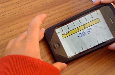
There are a lot of applications available for the iPhone, and thanks to the magic that makes orientation detection possible, some clever person produced an application that visually shows a level, bubble and all.

iPhone Level

Today I was witness to a young child asking to borrow an iPhone, and with much curiosity he opened this particular application.

Unfamiliar with a level, it’s function, or operation, he innocently asked, “What one was supposed to do?”

“You’re supposed to put the bubble between the two marks,” came the adult explanation.

The kid tilted the iPhone back and forth, watching the bubble slide to and fro, and leveled it holding the bubble between the two lines for a moment.

At that moment he blurted out excitedly, “Look, I’m winning!”

Unfortunately, his excitement caused the bubble to shoot to one end, just as I had time to click a picture of the event.

Reasonable Trial Durations: 30/30/30

I’ve come up with a way for trial software to be fair and recover lost sales opportunities. The secret: 30/30/30.

30/30/30While doing Java development, I was looking for a new IDE for Windows. Naturally, my hunt ended with IntelliJ, with Eclipse and NetBeans close on its heels.

What started the whole chain of thought for me, though, was IntelliJ’s trial period. Frankly, I really respect a company that has enough faith in their products that they let you use them, unencumbered, for a month in order to make an informed purchasing decision.

Oddly enough, though, it wasn’t enough. Allow me to explain.

The purpose behind a trial period is to allow end users to “log enough flight time” with the product that they know whether or not it meets their needs.

And here’s the problem. I have an existing code base of inter-related projects that I need to import into the IDE. And, since this is for work, my schedule is fairly swamped. I can only come up for air to do an evaluation once every week or two just for an hour or so.

What inevitably happens is this: I install the software, validate it installs, then a week or so later, I try to import; it fails, so I table the project until I have more time. A week or two goes by, and I try again, getting closer. Then, when I come up for air and try to get a bit further, the evaluation period is over. I’ve realistically had about less than three hours using the software, and none of it in the IDE writing code.

This happened to me last year as well.

And, what’s the natural conclusion at this point? I don’t know if it will meet my needs or not. Thus, a purchase doesn’t happen.

From marketing’s perspective, they think that the following scenario is the norm: a user downloads the project, tries creating a project, slings a bit of code, gets married to the IDE, and is willing to pay to keep the experience. In fact, I’ve done just this, and I really love IntelliJ.

But, no matter how much love I have for the product, if I can’t move our corporate applications into it from an existing source base, I can’t justify the site-wide purchase. End of story.

Oh sure, I could talk with the kind folks at JetBrains and ask for an extension, and I’m sure they’d give me one.

But that isn’t the point.

Being a software provider myself, I see this as a generic problem. What if I want to produce trial software that’s fair. I can’t have my customers not being able to make a well informed decision for running out of time.

Here’s my solution… 30 days, 30 invocations, 30 hours – Whichever Comes Last

Here’s how it works:

  • You’re guaranteed at least a month of physical time.
  • You’re guaranteed at least 30 invocations.
  • You’re guaranteed at least 30 hours.
  • When all three of the above goals are hit, stop the trial.

Implementing this isn’t be hard at all. It’s also quite fair and balanced.

If you are doing real work, making use of the application for 30 days, then you’re going to quickly chew through the 30 invocations and 30 hours.

If you have just haven’t even tried the software enough, you get 30 attempts.

Finally, the 30 hour rule recognizes if you haven’t had time to actually experience the software.

I’d like to see vendors start taking this approach. It’s a good one, too. It would certainly result in more sales.