Models: Getting more from a TFP/CD shoot

TFP/CD is an arrangement whereby a model and a photographer exchange professional services instead of one hiring the other. Surprisingly, though, many new models don’t know it exists, and those that do have some serious misunderstandings about it. Here are two secrets models might like to know.

Getting more from a TFP shoot
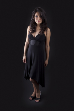
TFP/CD means “Time for Print” / “Time for CD,” and it’s an arrangement whereby a model and a photographer exchange professional services instead of one hiring the other.

Surprisingly, though, many new models don’t know it exists, and those that do have some serious misunderstandings about it.

I happened to be reading a discussion forum where some photographers were discussing photo shoots and the models were wanting quick turn around times on CDs. Reasonable. But then it dawned on me, perhaps it wasn’t clear too all what caused the delay. By the time I was done, I derived two secrets models might like to know.

For photographers, setting expectations up front is really important. Failure to do lets misconceptions propagate.

For instance, an inexperienced model may do a 2 hour shoot and roughly estimate the photographer took 500 pictures based on shots-per-minute during a scene and how long the total session was. When a CD doesn’t arrive within the next few days, anxiety replaces anticipation, and when it does arrive there may be only a handful of images leaving a model to wonder why it took so long. But what’s really happening? Did the model get screwed? Was the photographer lazy?

Is there anything that could have been done to get even more images, get some them sooner, or even get even higher quality images? Actually, yes.

The photographer in a TFP/CD deal is just as concerned about his or her reputation as a model is and doesn’t want anything substandard floating in the wild. As such images rarely go from camera to CD to model without review and processing.

Here’s the same scenario from the other side of the camera:

In reality, the photographer may have taken only 200 pictures. Photos are often taken in bursts and during makeup and wardrobe changes the camera isn’t firing; this counts for a lot of down time.

Of the photos, there will always be some that didn’t turn out: eye blinks, unwanted motion blur, lens flare, a horrible facial expression, hair obstructing the face, an unflattering fold of skin, an oil shine, a harsh shadow, undesirable lint, fly away hair, hot spots, exposure alterations, etc. The bursting allows for lots of micro differences to choose from, so that the best of a given set can be selected. To the untrained eye it can simply look like a lot of the same picture. This narrows down the usable images considerably.

Also neglected is that many photographers now also do their own photo editing. And that’s where the really time-consuming part starts. A single photo might take an hour just to get right. The higher the resolution photo and the sharper it is, the more time it takes. Often a photographer inspects every pore of skin. So, even if 20% of the photos are usable, this can represents a full-time week’s worth of editing.

Think about it; that’s 40hrs of follow-up work from a mere 2hr shoot. The misconception is that pictures are ready once taken, usually they aren’t. And, in a TFP/CD shoot, there’s no cash income from this job, so it’s very likely that this post-processing time has to come from in-between other paying gigs, which pushes out the delivery further depending on other commitments and schedules.

A studio uses TFP/CD to put their best foot forward, and that’s why the model greatly benefits from this. It’s unspoken, but often TFP/CD shoots get a little more time, care, and attention; one isn’t producing product, but art.

Sometimes whole segments that looked like a good idea during the shoot just don’t have the magic when everything is seen in context. As such, the photographer will often cull down from the usable photos to just the absolute best of the best and then spend a lot of time and detail on just those.

Believe it or not, the photographer also wants the model to have the images as soon as possible, because if they’re ready for the model’s portfolio, they’re also ready for the photographer’s.

I think the best advice to a photographer in this case is to under commit and over deliver. Don’t say it will take a week if it will take two. Explain that the goal is to get some small number of high quality photos, regardless of how many are taken.

And as for information to the model, the shoot isn’t over for the photographer when the last picture has been taken; that’s when the laborious and time consuming meticulous editing begins.

But here’s some secret advice that will get a model better product, sooner, and more of it:

1) If you are patient and have the extra time, offer during the TFP/CD shoot to allow the photographer to experiment with the lighting. Almost always there are a number of experimental configurations a photographer is secretly wanting to try, but he knows it’s high risk because it might not work perfectly and he doesn’t want to send you home with nothing. Conversely, it could really work out special and you’d have something new, amazing, and highly creative for your portfolio. By allowing for creative freedom, which might not work out, you actually increase your chances of getting super-spectacular shots. Photographers kill for models who let them tinker with experimental lighting.

2) If you are a tech-savvy model and are willing to accept electronic delivery instead of a CD, many photographers will happily send you email attachments or URLs where you can get your photos as they become ready. Because there is no bulk collection with a looming deadline, the photographer will often end up giving you more photos over the course of time, but you also benefit from getting those already done sooner. Plus, since you’ve set up a venue for delivery, a photographer revisiting prior shoots experimenting with new editing techniques has the means of sending you future updates for your portfolio as well.

Connecting Models and Photographers… why so hard?

There are numerous sites that proclaim to connect models and photographers, however based on the design and business models I’ve seen, I don’t think it can work in present form. Here’s why.

As a photographer that photographs models, there’s two primary goals that any website that tries to connect models and photographers should aim for:
Model: Leah M. - Image Copyrighted by Walt Stoneburner

1. Assisting a photographer in finding the right model.

2. Assisting the client in finding the right photographer.

All else is peripheral.

The idea is that if you’re a model looking for work, you post your portfolio online and photographers approach you with gigs. Conversely, if you’re a photographer, you post your portfolio and jobs start coming out of the wood work. The reality is that few sites can deliver on the promise adequately, not to a fault of the site’s objective, but due to design, business model complexities, or subtleties pertaining to the problem of brokering.

Naturally, for any such site to work you’re going to need a critical mass of both kinds of users just to have a wide enough selection to make this happen. As such, it’s important not to alienate users — something that is very easy to do with bad design or practice. It’s not enough that a site be free.

The closest site that I’ve come across that seems to have the right idea is www.ModelMayhem.com. It’s search capability is right on target. You tell it that you are looking for models in your local area that are some number of miles from your zipcode, that are between the ages of 18-24, female, 5’2″ – 5’7″, olive skin, with shoulder length black hair, green eyes, and poof — out pops a number of candidates.

This is the way it should work. You tell the criteria about what you need, and it finds people with those attributes.

The problem is the interface is klunky, the portfolio space limited, the navigation is horribly disorganized, and pretty much anything other than models is left wanting. Yet it’s still usable.

I wish it had a way to describe the kinds of services photographers offered and made them in a searchable fashion as well. Oh well, at least finding models isn’t problematic.

Such locator services are not a social network, nor are they a dating service. They’re supposed to be resources that connect professional with professional, with the added bonus of having a reasonable idea of what you’re getting. It frustrates me when a site is designed around chit-chat and messaging. Simply put let one professional find another, preview their work, and then get in contact with them by email; don’t obscure things. A site that works gets traffic, it doesn’t need fudging to get visitors.

Conversely, I just deleted my account over at www.aMuseBook.com, a web site that professes to do the same thing: connect models and photographers. I’d argue not only that it doesn’t, but that it physically can’t in my personal opinion — it’s a business model problem gone awry.

While better organized, and certainly much prettier, it’s search capabilities are downright awful. The best geographical resolution is state-level. So, if you’re looking for a model in Texas, that’s all of Texas. Additionally, providing search criteria for attributes just isn’t possible, which means locating a specific model by looks isn’t doable. And if you can’t find candidates, you aren’t going to be hiring.

Here’s another bad design choice that just seems obvious. If you want to find a model, you typically are looking for an age bracket, yes? Well, the site doesn’t let you search by age, instead you have to search by a specific birthday, which is stupid. Oh, and that’s a Day – Month – Year birthday at that. Even searching by year alone isn’t helpful, because simply year subtraction doesn’t give age.

Now while aMuseBook does give you more space to store your photos, it unlocks features using a point system. You gain points by commenting on people’s pictures and telling your friends to join. What becomes transparent very quickly is that the site is not structured to make contacts, but to get you to churn through pages so that Google Ads get thrown in your face generating an alternate revenue stream. I quickly got tired of being told in every email I have to “use” the site and it will ‘work’ for me.

Hogwash. If I can’t locate a model or post a comprehensive portfolio, then neither I, nor the models, are getting any serious value out of the site.

Adding insult to injury, the site gives you the ability to provide URLs to your own site; this sounds good at first, until you realize that many models and photographers keep their photos on Flickr. Why? Because Flickr is great for managing photos. But what does aMuseBook do for those sites? It blocks them out, showing up as www.*****.com, and when I questioned the site admin about it, I got back a response stating they didn’t want their site for depositing competitor URLs and not another portfolio site.

Wait a second. The service is there to help me find people by showing them my portfolio but they don’t want me to show them my portfolio if it’s elsewhere? Plus I can’t post my portfolio unless I leave comments that I wouldn’t have otherwise. That’s stacking the deck and gives unrealistic feedback. And when points are rewarded for clicking on ads, I’m pretty sure that’s against Google’s terms of service for AdSense.

If people are churning pages leaving “Nice smile” comments, how is one to know which comments are real (and therefore useful) versus people just trying to collect points? The information itself becomes devalued. Thus the business structure and the design alienates users in the short term, while the lack of utility alienates them in the long term. It can’t be viable.

And that’s why I deleted my account over there: It wasn’t usable or productive.

No wonder it’s so hard for models and photographers to get connected. I wish there were a simple directory that focused on doing one thing and one thing well, connecting professionals. It’s a hard problem, but the person that cracks that nut can steal a whole lot of business from all these other sites without trying too hard.

Fundamentally, the problem is that a brokering agent has to provide and organize information. Limiting it, not being able to search it, or failing to have a positive user experience drives away the very assets that are needed to make the site work. This appears to be a case where a well simple organized directory could be a winner-take-all.


UPDATE: I have found an awesome site for models, photographers, and makeup artists. It’s call Miss Online and it allows unlimited photo uploads with no point limitation schemes. It also includes discussions, groups, blogs, and email. The site is very active and quite attractive to use; advertising is at a minimum, and you aren’t coerced into clicking through tons of pages. Plus, and here’s the real proof: as a photographer I’ve had more exchanges with models with this one site than all the other sites combined. It does get you connected.

Garmin WebUpdater

I own a Garmin GPSmap 60CSx in order to geoencode my photography using HoudahGeo.

Garmin now has a means up updating the firmware in their GPSs by using a WebUpdater, of which I use the version for the Mac.

I Got Myself Into Trouble
In retrospect, I got myself into trouble by starting the program, it failed to detect the GPS, to which I turn on the GPS, and plugged it into the USB port. While the WebUpdater saw the device and went to update, it stayed in the “Erasing… Do Not Unplug” state for about two hours before I got brave.

What I Did, And Boy Was I Lucky
I couldn’t cancel. I couldn’t Quit. So I had to Force Quite by using Command-Option-Escape, that at least got WebUpdater to stop. The GPS was still stating “Loader Loading…” when I pulled the USB, and when that didn’t change anything, I turned off the power to it. I wasn’t so sure I was going to see much of anything when I powered it back on.

I got lucky. I turn the power back on and I was still at the old revision. Then plugged in the USB to the computer. Then started WebUpdater, which again noticed the GPS version, downloaded the firmware again, and had no problems installing it. Seems doing things in this order works just fine.

My Plans If I Was Unlucky
Over on Bill Turner’s site, he’s written an article about Fixing a Dead Garmin GPSMap 60CSx. It seems he’s learned holding down the Power Button and the Up Arrow at the same time while starting the WebUpdater software (I think he has three hands to pull this off), he’s able to force the GPS to identify itself to the updater. Problem is, according to his instructions, you have to keep holding down these button chord during the update; some comments on the blog state it isn’t necessary, and there’ve been mixed results as to whether this works universally or not.

I’m not sure I would have had the bravery to just go killing processes plain outright, but since Bill did such a nice job of providing an alternative, I felt it was worth the risk — even if I didn’t have to go that route. Thanks Bill for blogging your GPS recovery notes.

Jaw Dropping Photo Retouching

Put aside everything you think you know about photo retouching, as here are some serious resources for doing it just as the pros do.

In addition to capturing the perfect image and having the perfect lighting, you also need to know how to do photographic retouching.

While many of these sources revolve around Adobe’s Photoshop, you can also use Corel’s Painter, Gimp, GimpShop, or even Pixelator.
Yes, you know to shoot in RAW mode.

You may even know about Raw Developer, to eek out what your photo editing software can’t.

Huey Pro by PantoneYou might even know about the Pantone Huey Pro, which is the dual-monitor color calibration device.

Forget everything you know or think you know, here are the sources you need for high-end professional photo retouching!

Color Correction


A good photo has to take into account its color space, and it turns out the simple color wheel model is actually fairly simplistic. A color space looks more like a stretched and distorted multi-dimensional field. By deliberately contorting the color space, it’s possible to do everything from white-balance to invoke moods to increasing contrast.

Additionally, your camera has the ability to pick up more detail that you’re able to discern or your monitor can display. By stretching and twisting the color space, you can draw out more details in areas where you need it.

Instead of using the Levels control, building a strong command of advanced Curves will do wonders. Curves can be used on different channels. And, with selective masking, it’s possible to create images that are physically impossible for a camera to capture.

Curves effectively do a translation, but instead of linear relationship, the change can be dramatic in some places, less so in others. Think of it like a color spectrum on a rubber band, you can stretch portions of it.

The eye dropper tools in the Curves dialog help identify what should be considered white, what should be considered midtone, and what should be considered black for transformation. It may come as a surprise that it might not be ideal to have a pure black or a pure white.

Mastery of Curves allows you to deal with under exposed, over exposed, and color casted images. With a well exposed picture, it will help make the subject pop. It also affords some very clever use of creative coloring. And let’s not forget controlled desaturation can lead to many splendid images.

Once you learn how to really use Curves, you’ll have no need for Levels.

Certain color-space models play off of different strengths. Color need not be RGB.

Print, for instance, looks great when CMYK is used.

It turns out that for drawing out detail, LAB color space makes a world of difference.

LAB space is magical because it puts the luminance on it’s own channel. The tradeoff is that red/green become opposites on the ‘a’ channel, and blue/yellow become opposites on the ‘b’ channel. This works well, as often it’s the brightness you want to affect without washing out the color. For instance, LAB mode can remove unwanted fog and haze, magically pulling color out of seemingly nowhere.

Additionally, the Unsharp Mask can be applied to just the luminosity channel, pulling out extra details. If there’s noise in an RGB’s blue channel, one can covert to LAB, apply the Dust’n’Scratches filter to the B channel, and convert back. Blurring A and B will hide imperfections.

The A and B channels can be used to accent color. And if an image has an unwanted color cast, moving the curve out of A’s or B’s center point removes it.

LAB also has another amazing use: getting amazing selection masks from the channels.

Color Enhancement


Scott Kelby, a Photoshop guru, has identified that there’s really only seven steps needed to really push an image to the limits. This can make a horrible picture acceptable, and a well exposed image astounding.


  1. Use Open the file in RAW mode, even if it’s a JPEG, and pre-process there.
    Fix the white balance, and then do things like warm it up. Fix the exposure and twiddle the details. Information that’s clipped can be brought back into the color space.

  2. Perform the Curves adjustments.
    Bring out detail.

  3. Adjust the Shadows and Highlights.
    Pull out more detail, and set the mood. Good contrast makes a dramatic photo.

  4. Paint with light.
    Layers, gradients, and layer blending can simulate camera filters. A neutral density, for instance, can bring out the blues in your skies. In a more controlled sense, this is non-destructive dodging and burning.

  5. Channels Adjustments using LAB color space.
    By applying an image to itself with soft light, in LAB mode this produces aesthetic contrasts.

  6. Use Layer Blends and Layer Masks.
    Often the whole image won’t need uniform changes, this step brings all the elements together.

  7. Sharpening with the Unsharp Mask and fading the Luminosity afterward.
    Extra sharpness can be pulled out to provide what looks like a really in focus image. Doing it this way removes color halos that may appear.
You don’t apply every step for every photo, and it’s important to recognize less can be more. The cumulative effect of these steps is what get results. Also worth mentioning, the order is important.

Professional Retouching


Most retouching instructions inadvertently make a model’s skin look like plastic. They focus on the Gaussian Blur filter, screening layers, and use the Clone tool, and the Spot Heal Brush. This might be acceptable for small web images, assuming you want that look.

It’s not what the professional do.

Why not? Those activities destroy information in the image. That means the image looks fake and retouched when viewed up close or when it appears in print.

To do things right, you need a solid command of color spaces, the Healing Brush, the History Brush, Dodge/Burn brush, Warp/Liquify tools, and Unsharp Mask. Most changes are made with Adjustment Layers, so the image is actually a composite of small, controlled alterations. This is time consuming and can be tedious if you don’t know the numerous shortcuts of your post-processing application.

To make a clean image, one uses the Healing Brush with sampling from all over the image. Reshaping parts of an image requires the Liquify tool, and to alter the whole image the Warp tool is used. These activities can damage data, which is why after using them cleanup with the History Brush is necessary. The goal is to preserve detail and remove imperfections.

Since the magic of photography is in capturing the light, not the subject, having controlled contrast makes an image stand out from the rest. What makes a good professional photo retoucher isn’t the blemish removal or pushing of pixels, it’s the re-sculpting of the image in 3D.

In this context, I’m not talking about modeling tools like Poser, Blender, Animation:Master, or DAZ:3D. No, I’m talking about the illusion of depth created with shadows and light.

Face Painters are do this to reshape the face, using smooth gradient blending and edges to create fantastic illusions. The dodge and burn tools, along with an decent understanding of human anatomy, will let you get a model closer to that perfect body.

The insight comes when you realize things that are further away are darker, and things that are closer are lighter. By performing slight emphasis on naturally falling light, shadow, and edges, it’s possible to enhance the perceived depth of the photo’s subject. By adding or removing light, it’s possible to alter the shape of the subject in very flattering ways that are not perceptible unless you compare the image to the original.

Total reconstruction is possible when sampling can be used to build the right textures, hue and saturation can set the right colors, and dodging and burning can create the right shadows to convey a shape or edge.

Bringing It All Together


The name of the game is contrast and sharpness, and with the resources above, you’ll be able to produce some jaw dropping images.

Mind you, there’s no magical automated formula. One image can take literally hours, but the results are worth it.


Photo by Walt Stoneburner

Three Photography Books You Need

Here’s three great photography books you’ll want in your library that you might have overlooked at the bookstore. Two cover how to take an amazing photograph, the other is how to compose them.

Photography, good photography, is a complex and deep subject, primarily that it’s an art about making trade-offs. A while back, I wrote about The Best Photography Books Ever on Light.

I’d like to now share three photography books that you need in your personal library.

The first two come from Scott Kelby, whom you may know from the National Association of Photoshop Professionals (NAPP) because he’s the Editor in Chief of the Photoshop User magazine.

If you’re one of “those” people, hang in there. It’s worth it.

Scott Kelby. People either love him or hate him. He has two common complaints against him, which I personally think are unfounded or are at least irrelevant. The first is that he has a ‘unique’ writing style which injects a bit of humor into his books. I like it, it makes them more personable and less dry; some want him to cut to the point. The second is that people accuse NAPP of being just a Scott Kelby fan club, and that he can do no wrong. I haven’t seen that, I just know I’ve learned more new tricks from Photoshop User than elsewhere. Kelby is good, Kelby delivers, and so do these two books. If you’re an Anti-Kelby person, at least browse them when you feel no one is looking.

The Digital Photography Book, Volume 1

The Digital Photography Book
Volume 1

 The Digital Photography Book, Volume 2

The Digital Photography Book
Volume 2

The trick here is not to make the mistake by looking at just the covers that one book is a reprint of the other. They are two separate books, and you want both.

The Digital Photography Book (ISBN 0-321-47404-X) addresses how to get really tack-sharp photos by doing things like using the lowest ISO, good quality glass, turning off your image stabilizer, using a sturdy tripod, finding the “sweet spot” in your lens, locking your mirror up first, and using a remote shutter release. Yes, it covers how and why.

You even get tips on how to do a bit of post-processing for extra sharpness, using Unsharp Mask and LAB Colors (not RGB). Even if you’ve done photography for a while, there’s gonna be stuff in here you most likely didn’t know. Or didn’t know how to do well. Or easily.

There’s also practical advice along with little cheats you can do. You’ll understand a light a little better and manipulate the scene to get those wonderful backgrounds and deal with problem lighting problems. If you got yourself committed to taking wedding photos, there’s an important section you need to know.

A lot of photography has to do with composition and compensation. Ever notice how two photographers with the same gear can take a picture of the same thing, and one gets an incredible shot, and the other gets a boring and flat images. You’ll learn why and how to get the good shot.

There is even a wonderful section on how to take fantastic portraits; a section on avoiding mistakes; equipment recommendations; and even a section that shows “if you want this kind of photo then do this.”

The Digital Photography Book, Volume 2 (ISBN 0-321-47404-X) covers flash and strobes, reflector tricks, impressive seamless/colored backgrounds, advanced light metering, and how to get those multi-light touches on your subject. More portrait tricks are revealed, along with low-light, sunrise, sunset, and landscape scenes. More is covered on bad weather conditions, weddings, and touring. Again, there’s a shot recipe section in the back. This book is clearly a continuation of the first and not an afterthought or a sequel to make more sales. Good quality stuff.

The next book in your collection should be The Photographer’s Eye by Micheal Freeman (ISBN 0-240-80934-3).

Composition is hard to master. Things like frame dynamic, tension, placement, rhythm, etc. all seem pretty artsy-fartsy hand-waving mumbo-jumbo to anyone who’s trying to study the science behind creative photography.

This book explains with contrasting visuals what these terms mean and what you can do to get them. A fantastic illustration (p. 25) shows a bench in a field, but simply by cropping and using angles, the viewers eye is compelled to follow in different directions.

You’ll see how and why the rule of thirds works, how there’s also the golden ratio frame, fibonacci divisions, geometrical slicing, and fractals as alternate methods of placement. You’ll know when to fill the frame, when not to, and where not to. You’ll control the horizon. Convey balance though perceived weights, not just mirroring placement. Foreground, background, contrast, repetition of patterns, broken patterns, perspective, forced perspective, limited color, …there’s so much here.

This book alone will change the way that you view a scene and provide you many different ways to capture it, both in camera and how to make an even more impressive photo by elimination back post-processing.

So there ya have it. Two books to take a really amazing picture, and one book to compose a fantastic one.

REVIEW: Walt gives all three titles here two thumbs up!

Photographers a Threat? Uh, no.

Bruce Schneier talks about The War on Photographer, where photographers are presumed to be terrorists. This stuck a chord with me, as I’m a photographer, and I have been stopped in the manner Bruce describes.

In Bruce Schneier‘s CRYPTO-GRAM, he includes a reprint of a fantastic article entitled The War on Photography.

Excerpt:

Since 9/11, there has been an increasing war on photography. Photographers have been harassed, questioned, detained, arrested or worse, and declared to be unwelcome. We’ve been repeatedly told to watch out for photographers, especially suspicious ones. Clearly any terrorist is going to first photograph his target, so vigilance is required.

Except that it’s nonsense. The 9/11 terrorists didn’t photograph anything. Nor did the London transport bombers, the Madrid subway bombers, or the liquid bombers arrested in 2006. Timothy McVeigh didn’t photograph the Oklahoma City Federal Building. The Unabomber didn’t photograph anything; neither did shoe-bomber…

As a photographer, I have been stopped by security guards, questioned why I was photographing a building, and probed who I was working for. Bruce explains while not only is this nonsense, but a waste of resources and money.

The article’s short. Take a moment to read it. It brings common sense back to the equation.

I’m a photographer, and if I take a picture of something, it’s because I like it and want to preserve it for others to enjoy too.

Canon Powershot SD890 IS

The Canon SD890 IS is a capable camera, but the one thing I’m not too fond of is the physical interface, and if I had to gripe about anything in particular, it’d have to be the on/off switch.

I love my Canon Powershot A570. Apparently, so does my wife. I know, because I don’t get to play with it very much anymore. That’s why I got the SD890 IS.

So, why would a photographer with a Canon EOS 5D that can produce images that look like these need with a point-and-shoot camera, you may wonder?

Turns out it isn’t always convenient to pull out a full sized digital SLR. Especially if you’re driving down the road, sitting at work, or floating down a river. What’s ideal is a camera that takes good enough pictures, and if it gets destroyed you won’t be mad at yourself. Well, not for long, that is.

As such, I found my self eyeing the Canon Powershot SD890 IS. It’s a small, 10 megapixel camera, with reasonable 5x optical zoom, image stabilizer, and face detection. The feature list is pretty neat, in that it an do sound recordings, movies, stop motion, high ISOs, macros, panoramic stitching, spot color, color substitution, and has all the manual goodies you’d expect from a real camera. USB connectivity, and even weirder, video out that looks like a USB connector.

However, what I’m not thrilled with is the physical interface to the camera. In an effort to be stream lined, it “feels cheaper” than my other power shots. And I’m not just talking the small 32MB SD card that comes with it.

To start with, the on/off button is plastic and needs to be pressed in a considerable way in order to turn the camera on and off. Not only does it need to be pressed in, but it has to be at a particular angle or nothing happens.

Originally I thought I had received a defective model and actually ended up returning it to the store, which incidentally was not BestBuy for good reason. The returns person was unable to turn on the camera. When it was turned on for her, she was unable to turn it off.

While I appreciate the need to not have the camera activate while in one’s pocket, it’s still imperative that the camera can be activated upon demand.

Canon SD890 IS Interface Problems

The zoom in/out ring on top feels rugged enough to hold up to use, but the mode selector for automatic/manual/scene/movie is so sleek in design, it’s uncomfortable to change modes. Instead of turning the side of a wheel, with most Powershot models, it requires more thumb torque than you’d initially expect.

I’m not thrilled with the review mode being a button instead of a setting on that dial, but I also have to admit that it makes the review process very easy. That, I assume will just take some getting used to.

The only other real complaint is the lower wheel-like interface for changing sub-modes and selecting menu items. It’s a rotating shuttle, that’s also a N/S/E/W rocker switch, that also has a button in the middle; all slightly smaller than the size of a dime. Navigation is difficult, and not for the reasons you’d think.

While the ring-wheel for selection is a nice way to change modes, you have to exaggerate the amount you turn it to change to the next selection. Thus the perceived required turn amount in the GUI is far less than what is actually required, making you think it isn’t working, when if fact it is. It’s not overly sensitive, but the exact opposite. I’ve yet to be able to find a way to adjust the spin sensitivity on the control dial.

There is tactile feedback which feels like little stops as the wheel turns, but it’s clear the GUI is not looking for how many of those pass by (distance), but rather speed. Slowly turning the wheel does nothing, no matter how many increments it literally feels like you’ve passed.

Luckily, since it also acts as a rocker switch, the GUI responds to this, so it’s not as big of a deal as one might think. It just feels awkward, though the GUI is totally usable.

Aside from that, the LCD is large and bright. The display shows all the settings you’d need for information, and it’s easy to find settings. In particular, I’m impressed that it’s possible to overlay a grid and 2:3 shading, which makes composition all the easier, especially with face recognition properly focusing.

The camera doesn’t have as many models as it’s smaller predecessor, but then again, it’s got better optical resources and a slightly smaller footprint, which scores high in the portability scale.

The one thing I wish it did have was the ability to use standard AA batteries. Normally, I use rechargeable AAs, but it’s nice to know in a pinch you can use a standard household battery. Nope, for this camera you need a special Canon NB-5L 3.7V 1120mAh(Li-ion) battery. Small, light, compact, charges quickly, lasts a while, but still — if it goes dead, you’re out of commission.

All in all, though, if I have to judge it based on the quality of pictures, I’d have to say it’s a very capable camera. Handy to carry, easy to use.

REVIEW: Walt gives the Canon Powershot SD890 IS a rating of 4 out of 5 stars.

UPDATE: The camera does not have a Aperture or Shutter Priority mode.

REVIEW: Walt downgrades the Canon Powershot SD890 IS a rating to 3.5 out of 5 stars.

The Best Photography Books Ever on Light

Without exception, two books leap to the front of my personal library when it comes to Photography.

Light: Science and Magic
Light: Science & Magic
Crime Scene Photography

Most photography books explain general principles of photography, how the camera works, and, if lucky, perhaps a simplified discussion of optics and proper metering. By the time you really understand the relationship between ISO, Shutter Speed, and Aperture, and are capable of shooting in Manual mode, you’re not done — you’ve just scratched the surface. The next subject you need to tackle is light, and it is light that allows you to get those really dramatic and interesting shots. And if you think because you own a 50mm f/1.4 lens, you know it all; think again.

Light: Science & Magic is a masterful excursion into the role that light plays with photography. It covers light sources, reflection, and angles, explaining why surfaces look the way they do. Certain objects are hard to photograph, such as glass or white subjects on white backgrounds. Either detail is lost or everything comes out gray. This resource shows how to use light to solve those hard problems. The section on diffused, direct, and glare reflections is worth the price of admission alone. Camera placement, light placement, and gobos, combined with the right metering technique, will yield stunning images. It covers methodologies of lighting portraits in fascinating ways. The book is littered with tips and tricks from front to back. It’s odd to find a book where there’s solid, approachable, directly applicable material on every page, but this book does it.

The next book is quite unexpected, Crime Scene Photography. This book goes far deeper into explaining the workings of photography, delving into the mysteries of optics, proper exposure in bad lighting conditions, and the clever use of filters. It clearly explains inverse square laws, plays with subtle differences between intensity and distance, unravels why rules of thumb actually work, shows how to get the most from a flash. And all these topics roll up to support how to draw out the details you want to capture, including from fluorescent and infrared sources. There’s tons of information to convey size and play with perspective, deal with underwater situations, and how to digitally correct severe problems when you can’t retake the photo. The book is chalked full of examples.

Frankly, if I could only own two books on photography, it would be these. I read the again, and again, and again.

Walt gives these books, two thumbs up!